May The 4th Be With You — A Short History of Star Wars Design
I wouldn’t be myself if on May 4th, I didn’t talk about one of the most iconic pop culture films in cinematic history, Star Wars.
I have been in love with cinematography since I was a little girl. My dad used take me to the cinema for all the new productions, regardless of his own opinion about them. While he would sometimes be falling asleep — his eyes half open — I was absorbing every colour, light and image on the big screen. When I entered the cinema and the lights turned off I felt the magic of what was about to happen. I always admired the human ability to create unique stories based on their imagination and life experience. And just like that, 20 years have passed, I still exchange movie titles with my dad and still feel butterflies in my stomach when I hear the opening tunes of the film.
I have never had the chance to watch the original Star Wars in the cinema, but it is on my bucket list. The imaginative storyline, memorable characters and stunning visuals are the core of all George Lucas creations and seeing it on the big screen must be a whole new level of cinematographic experience. Of course I’ve seen new movies from the Star Wars universe, but a big part of me enjoys the retro vibes of “Star Wars: Episode IV ‑ A New Hope”.
As a designer, I admire the level of detail put into the look and feel of the Star Wars saga. From costume and product designs to designing full environments, the visual language of Star Wars is a crucial part of its universe. Typography, symbols, illustration and user interface are also key ingredients to its out-of-this-world experience.
In graphic design and art, we build a visual language by starting from the general look and feel before focusing on little details, which allow us to build unique, yet consistent brand language. The same rule applies to design in movies and today I’d like to invite you to explore the Star Wars design journey.
General Design Rules
In the design industry, we aim to build strong, unique brands which will stand out in a crowd. Graphic designers who specialise in movies follow a different rule — design has to blend within the movies landscape rather than playing the main role and to an extent, feeling like it wasn’t designed at all. Doug Chiang, an American artist and product designer, who happens to be a Creative Director of the Star Wars franchise, recalled that George Lucas says “I don’t want anything to stand out”. Movie graphic designers need to build the atmosphere of a scene by blending details. The flashing light on the computer cockpit isn’t more important than the core dialogue, but it may help with its rhythm and balance in the scene.
Another rule that George Lucas quite rightly requested, is that the space can’t look like a designed set. If you think about the movie Dune (directed by Denis Villeneuve), which I’m a huge fan of, every scene can be an award-winning photograph. However, Villeneuve’s concept from the very beginning was to mix the brutality of humans with the calm and grandeur of nature (fantastically executed by Greig Fraser). In Star Wars though, the cinematographers were looking for quite a natural, familiar feeling. They created a world which looks like ours, but it’s just in a different galaxy. They use vehicles, clothing or even landscapes that are familiar to us, but put them in a different scenography. That’s a great way to create a unique world, yet one that makes you feel at home.
One of my favourite scenes in Star Wars: A New Hope is the cantina scene. Unique creatures and weird machinery mixed with swing music and a classic bar atmosphere created this remarkable scene.
Lucas’ galaxy appears fantastical at first, however, it’s designed by using well-known architectural styles. One of the examples is Theed Palace in Naboo. It’s design is a combination of Byzantine exteriors and Baroque/Rococo interiors, mixed with the style of well-known American architect Frank Lloyd Wright.
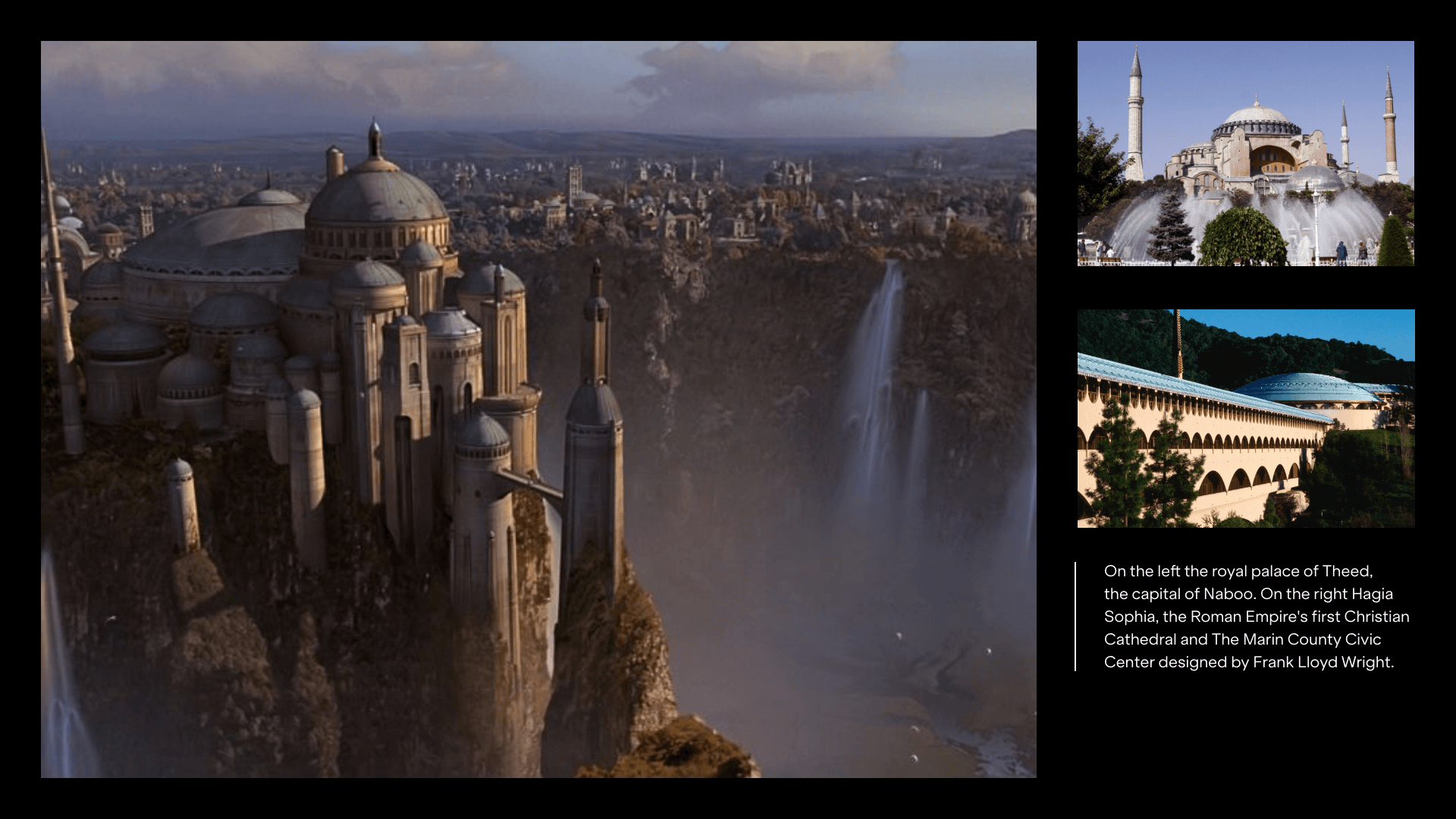
Examples of Star Wars architecture
By connecting familiar elements and putting them in a new context, designers for Star Wars create a unique, sci-fi world, which seems exceptionally familiar to our own.
Photography in Star Wars
Looking at current cinematography achievements it may seem like the original Star Wars are too old to even be considered as a photography innovation. However, back in 1970, when John Dykstra, a special effect artist and his team were working on the very first Star Wars movie, they created a real game-changer: the first digital motion control camera system which was specifically designed for Star Wars. Dykstraflex increased the precision of the camera movement. Instead of moving the miniatures in front of the camera (like in Battlestar Galactica), Dykstra’s team decided to move the camera around the smaller models which allowed them to simulate the fights and battles. Regardless of the massive delays (and finally his job loss from Star Wars set), Dykstra and his team won Academy Awards for best special effects and special technical achievement.
But what’s the secret behind the lovely shots and colours in all the Star Wars movies?
Well, not surprisingly, Star Wars cinematographers also follow classic design rules: Emphasis, Balance (or Symmetry), Alignment, Contrast, Repetition, Proportion, Movement and White Space.
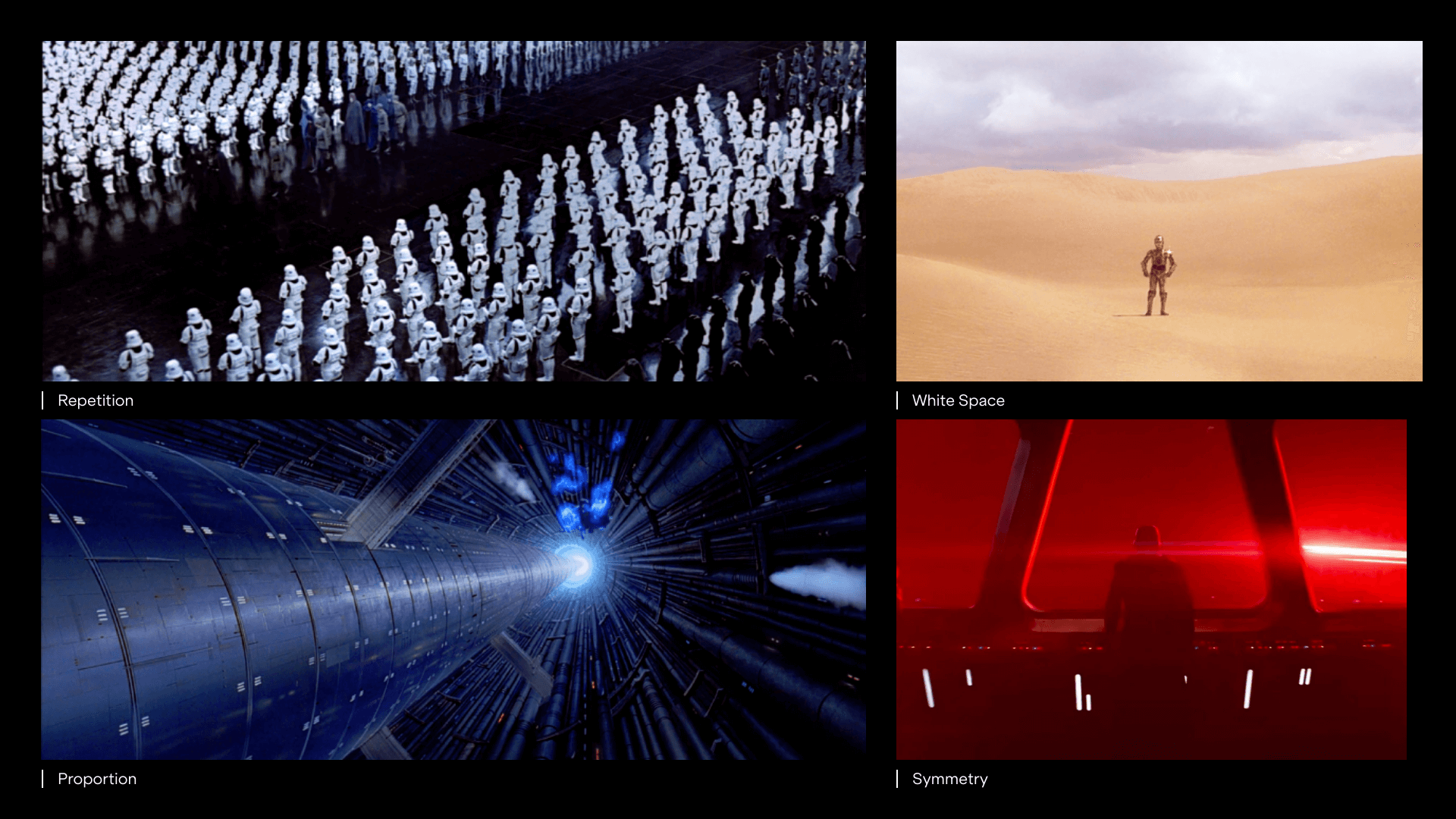
Examples of photography in Star Wars
One of the examples of repetition in Star Wars is the scene from Return of the Jedi, where stormtroopers were shown from a distance as repeated visual elements emphasising the scale of the army. In graphic design, we use repetition through patterns, lines or colours, as well as the proximity of familiar elements to create a specific feeling for the audience. Another example of classic design rules would be the use of proportion by blowing up the scale the Death Star. This technique creates a feeling of fear of irreversibility and emphasises the difficulty of the challenge. In Star Wars VII: The Force Awakens, there is a scene where the resistance generals compare the old Death Star to the StarKiller Base, which is a new Death Star just significantly bigger. It makes me giggle every time I see it ;).
Graphic Design in Star Wars
Starting with the logo, the designers of Star Wars merchandise created a unique visual language, inspired by different art movements and historic events.
The iconic logo is a result of a collaboration between the film’s director, George Lucas, and graphic designer Suzy Rice. I think George Lucas’ brief would be surprising for most modern designers. He was looking to intimidate the viewer by asking for the logo to appear “fascist” in style. It makes sense considering the plot of the movie.
When designing the logo Suzy Rice looked for inspiration in a classic Italian typeface and German font design. The result was a simple, yet bold lettering using Helvetica Black in yellow on a black background. She finished it in 1976 and, while its one of the most recognisable logos in cinematic history, sadly Rice’s contribution wasn’t initially credited in the film.
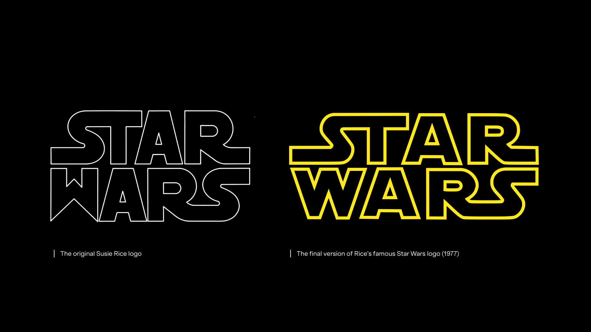
Star Wars Logo. Original concept (left) with final movie version (right)
Along with the logo, the designers also created a set of symbols for different organisations/factions within the universe. Now, let’s do a small exercise. Have a look at the symbols below. What they remind you of?
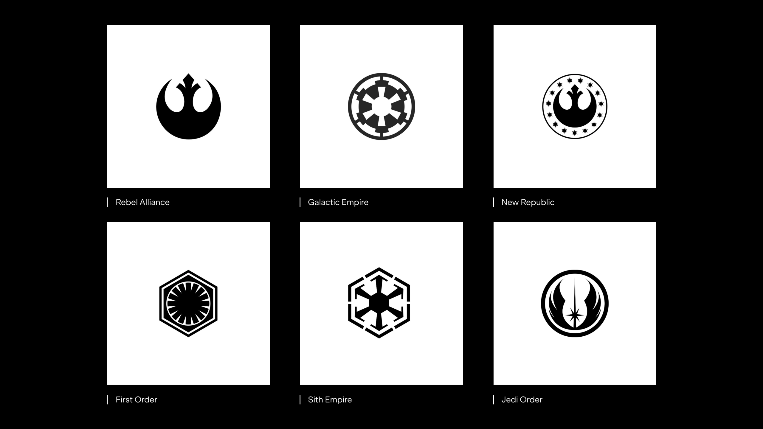
Star Wars faction symbols
Firstly, you may notice what they all have in common – rounded shapes, sharp corners, repetitive elements, white space, alignment and symmetry. For centuries geometrical shapes were associated with sacred life and the universe. Semiotics, the study of signs and symbols, proves how we build strong connotations regarding symbols and pictograms. The logos above are inspired by ancient pictograms from Egypt, America, Rome and Greece. They were used throughout centuries to emphasise strength, power and mysticism when building empires, hence why they were a perfect inspiration for the Star Wars design team.
User Interface
The colour palettes, physical buttons, lights, typography and numerals in the Star Wars UI create a wonderful experience for a viewer. From the very first movies to the latest productions, the complexity and detail of the user interfaces are truly out of this world. The usage of strong lines, blueprints, and sharp edges create a retro, space vibe, while (obviously) being perfectly usable on the spaceship.
The latest work for Star Wars digital design was created by Design Studio Blind. They have done an excellent job extending the feel of the original movies. Keeping the essence of the Star Wars language whilst adding a new level of complexity and interactivity to it.
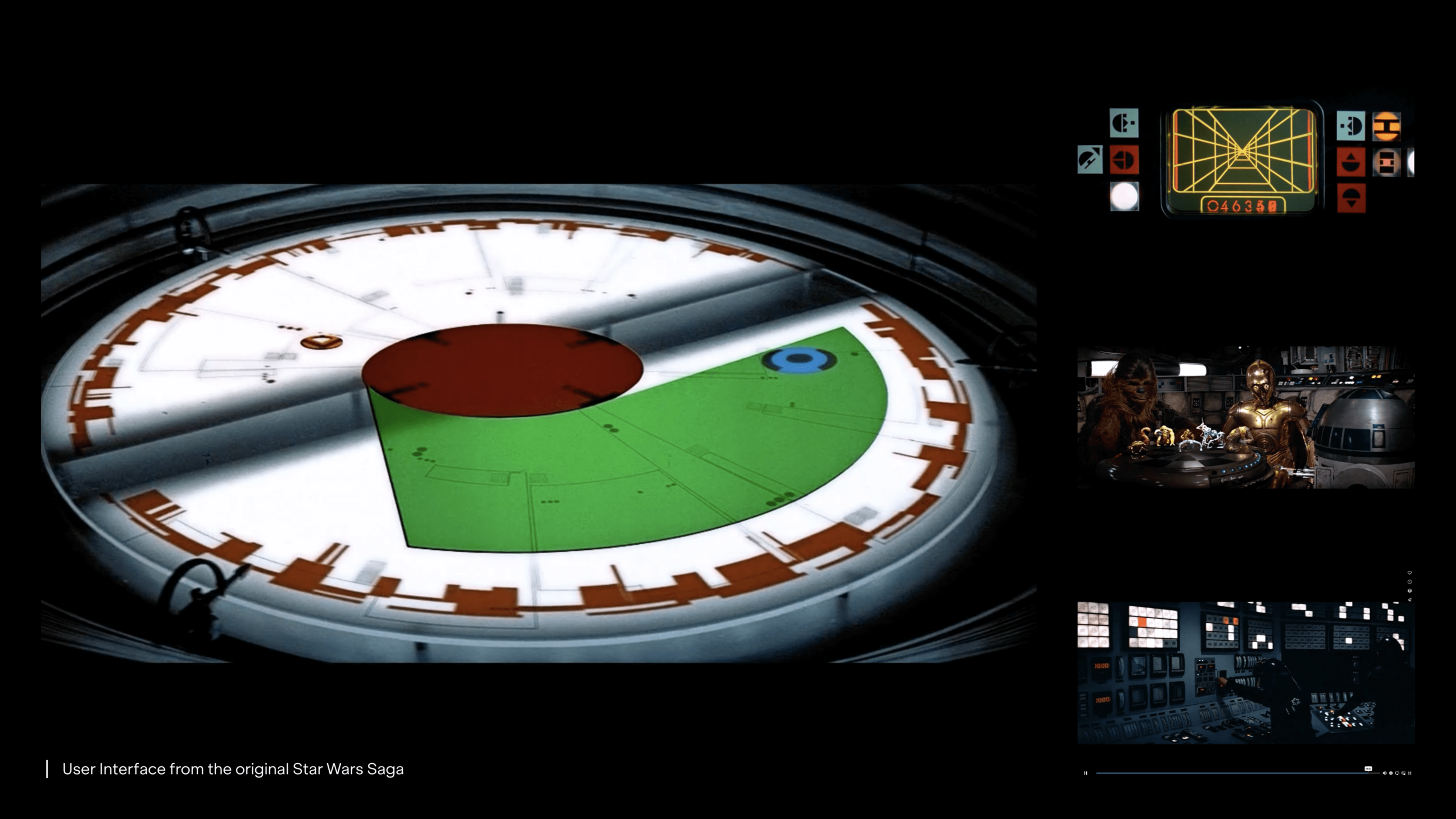
Examples of user interfaces within the Star Wars universe
Design in Cinematography
Graphic design has always played a huge part in the cinematography world. While we often associate graphic design with promotional materials or movie posters, from the unique vehicles in space to the lettering on the box of matches held by a main character, designers are a core part of the movie crew ensuring the visual storytelling matches the overall storyline in every aspect. Annie Atkins, a movie graphic designer, known mostly for her work for Grand Budapest Hotel, said that graphic design in movies helps the story come to life. And well, I couldn’t agree more.
You may love or hate the Star Wars universe, but I hope showing you the work behind an enormous production like that will give you another level of appreciation for the many specialists behind it. And maybe, next time when you’re sitting in the cinema waiting for the magic to begin, you will look differently at the title design, photography and all the graphic design hidden between the actor’s lines.
You may not believe in light and dark side, but I have to say… May the 4th be with you!


