Adaptive Design vs. Responsive Design: Choosing the Right Approach for Your Website
In the ever-evolving world of web design, two terms frequently appear: adaptive design and responsive design. While both aim to enhance the user experience on various devices, they have distinct approaches and applications. In this blog post, we’ll dive into the key differences between them, helping you make an informed decision on which approach is best for your website.
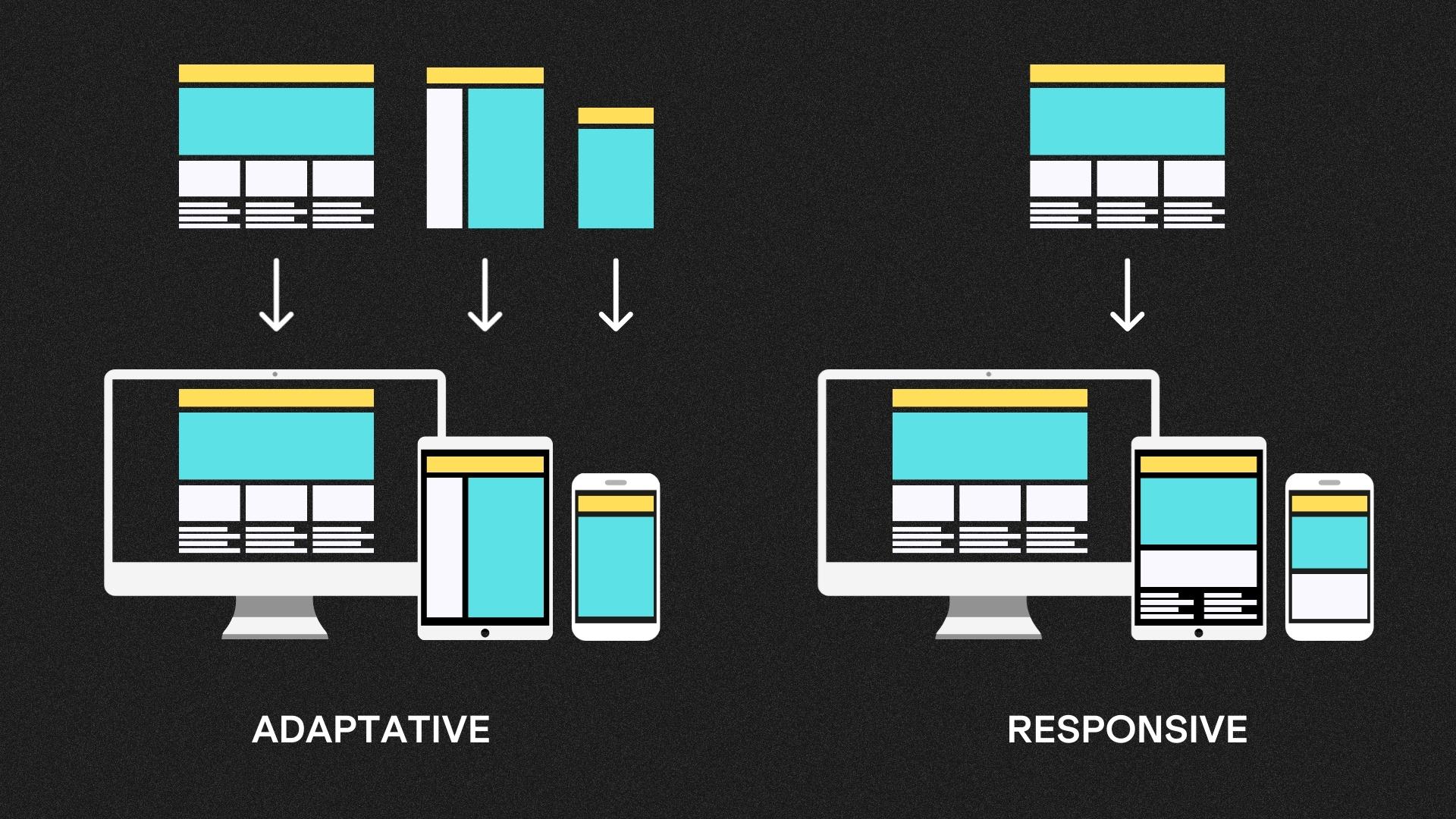
Adaptive Design
Adaptive design, sometimes called dynamic design, is a web design approach where a website is created with multiple layouts tailored for specific device categories or screen sizes. This means that instead of a single, fluid layout that “responds” to any screen, adaptive design utilises pre-defined layouts optimised for different devices, such as desktops, tablets, and smartphones.
Responsive Design
Responsive design, on the other hand, is an approach that uses a single fluid layout to automatically adjust and reformat content to fit various screen sizes and resolutions. It uses flexible grids and media queries to ensure the website looks and functions well on any device, from a large desktop screen to the smallest smartphone display.
Key Differences
Approach to Layout
- Adaptive Design: Uses fixed layouts designed specifically for different device categories. When a user accesses the site, the server or browser identifies the device and serves the corresponding layout.
- Responsive Design: Utilises a single fluid layout that adapts in real-time based on the user’s screen size and orientation.
Development Complexity
- Adaptive Design: Requires the creation of multiple layouts, which can lead to increased development time and cost.
- Responsive Design: Generally more efficient and cost-effective as it involves a single layout that adjusts using CSS and media queries.
Content Loading
- Adaptive Design: This may lead to slower load times as multiple layouts require more server-side processing to identify the user’s device.
- Responsive Design: Typically offers faster load times since the layout adjusts in the client’s browser without server-side processing.
User Experience
- Adaptative Design: Can provide a tailored user experience for each device category, potentially optimising content and features.
- Responsive Design: Offers a consistent user experience across devices, ensuring that content remains accessible and readable but may not be as device-specific.
Maintenance
- Adaptive Design: Requires ongoing maintenance for each layout, potentially making updates more complex.
- Responsive Design: Easier to maintain as changes apply universally across all devices.
When to Choose Each Approach
- Adaptive Design: Consider adaptive design when you have specific requirements for different device categories. This can be advantageous for complex, high-traffic websites that need to provide a customised user experience on various devices.
- Responsive Design: Opt for a responsive design for a cost-effective solution that provides a consistent user experience across all devices. This approach is ideal for content-driven websites and those with limited resources for ongoing maintenance.
Conclusion
Adaptive design and responsive design are both valuable tools in a web designer’s toolkit, each with its own unique strengths and weaknesses. The choice between them should depend on your specific project goals, budget, and the user experience you aim to deliver. Ultimately, the success of your website will depend on your ability to choose the right approach and execute it effectively to meet the needs of your target audience.


