Nostalgia Behind Wes Anderson’s Movies
Most of you reading probably don’t know, but I used to be a scout for quite a few years. Every now and then when I enter the forest all my memories from childhood come back leaving me with a bitter-sweet feeling of nostalgia
So, when I saw the Moonrise Kingdom trailer I knew I had to see it. The warmth and grotesque of the storyline mixed with melancholy towards my own scout adventures made me fall in love with Anderson’s art from the very first scene. And, of course, convinced me to have a closer look at all of his filmography.
From Fantastic Mr Fox to French Dispatch, Wes Anderson delights us with theatrical storylines, colourful cinematography, and a unique sense of humour. And, as you may expect, graphic design plays one of the main roles in his movies, right next to the leading actors.
Every movie I’ve seen so far leaves me with a warm feeling in my heart long after leaving the cinema. I began to wonder — how does Anderson make me feel so nostalgic? Is it his love for naive romance? Beautiful design or retro colours?
Let’s dive into his art from a design perspective – and properly analyse the components of his unique style.
Symmetry and Composition
Anderson’s frames are beautifully composed, often featuring symmetrical arrangements and centred subjects. This deliberate use of composition creates a visually pleasing and balanced aesthetic. Have a look at the shots from Grand Budapest Hotel below:
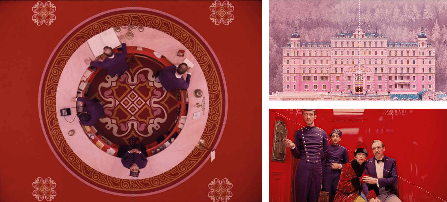
Examples of photography in Hotel Budapest
Anderson doesn’t leave anything to chance. He pays attention to textural details in his films, using patterns, textures, and graphic motifs to enhance the visual experience. These details can be seen in wallpaper designs, costumes, props, and set decorations, adding depth and visual interest to the overall symmetry of the composition – bringing harmony and balance.
Symmetrical editing is based on a few key elements: composition, blocking, staging, pattern events and rhythm. I’m sure you’ll agree with me – he uses every one of those.
Another example of symmetrical editing can be found in Moonrise Kingdom. The camera follows the actors walking symmetrically, which visually aligns Sam and Suzy – the lovers.
Colour
Anderson employs vibrant and carefully selected colour schemes in his films. He often favours pastel hues, creating a whimsical and nostalgic atmosphere along with the colours being typically rich and saturated. In The Life Aquatic with Steve Zissou (2004), blue and orange shades reflect the marine environment and the melancholy of the main character. Blue uniforms, red knitted beanies, every visual aspect is a part of the storytelling. Red is an emotionally intense colour and Anderson is aware of that. In Grand Budapest Hotel the use of strong purple and red emphasise danger.
Fantastic Mr Fox has sandy, delicate shades mixed with intense oranges and greens. However, one character is completely different from the others – the mythic wolf is shown in black & white. This smart visual concept created a sense of unease and emphasised the danger behind the mysterious creature.
On the the other hand, in The Moonrise Kingdom muted yellows, pinks and blues emphasise naivety and childhood nostalgia, as a perfect background to the teenage love story.
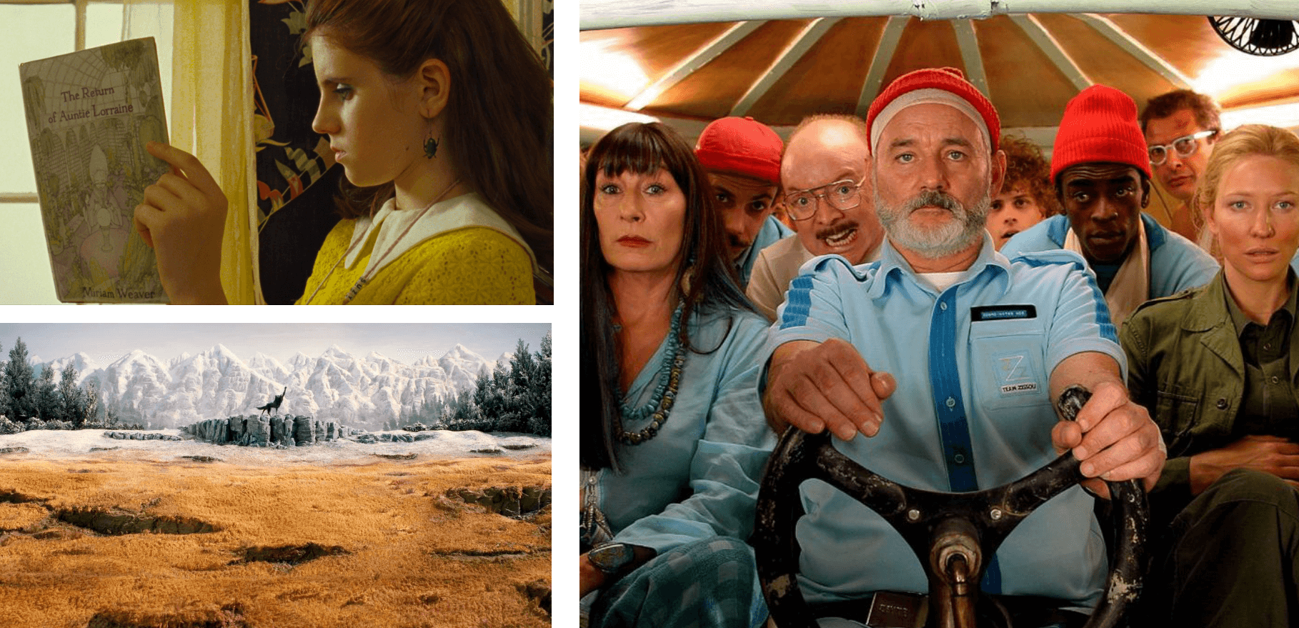
Examples of photography in The Moonlight Kingdom (top left), Fantastic Mr Fox (bottom left) and Life Aquatic (right)
Typography
Anderson’s movies’ opening and closing credits often showcase unique and stylised title sequences. These sequences feature custom-designed typography and illustrations that reflect the film’s themes and tone. Each title design is distinct and contributes to the overall visual identity of the movie.
Anderson frequently uses the Futura typeface in his films for signage, titles, and other graphic elements. Futura’s clean and geometric design aligns with Anderson’s emphasis on symmetry and precision. It is a modern and highly geometric font, inspired by the visual elements of the Bauhaus, although not directly connected with it. It was designed by the German Paul Renner in 1927.
To understand how important and detailed Wes Anderson’s typography is, have a look at Eric Helmin’s design below, even the engraving on the scout’s costumes has a predefined font! If only mine was like that.
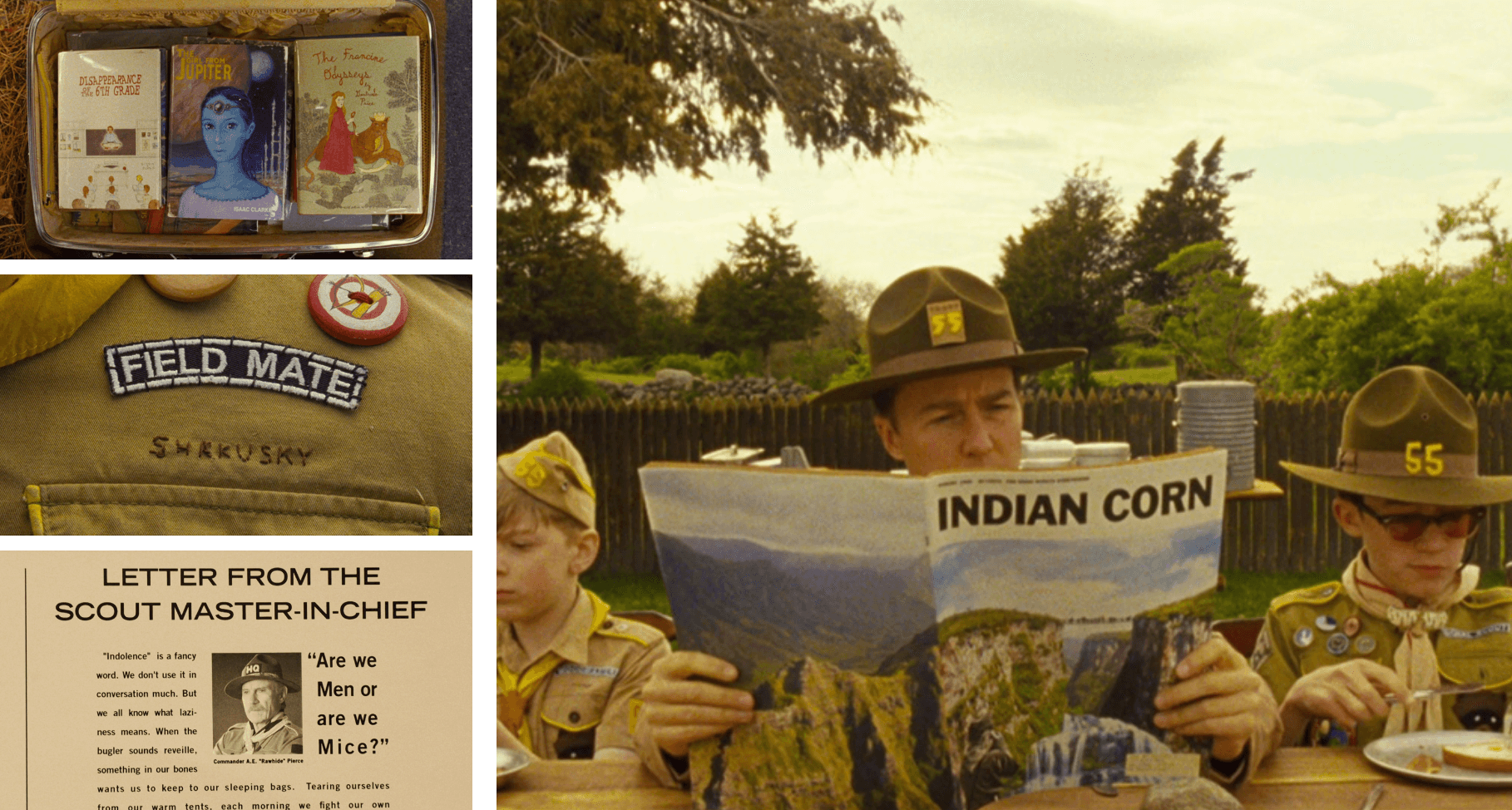
The use of typography in examples
The title of Moonrise Kingdom is designed by lettering artist Jessica Hische. The artist took inspiration from an old French New Wave film La Femme Infidèle, released in 1969 and mixed with 1960′ America vibe. The sweet and playful font in an array of bright colours appears in the opening and close titles emphasising (again) nostalgia in the overall plot.
In Royal Tenenbaums Anderson’s passion for Futura becomes almost an obsession – he uses the font for almost everything, which creates a very consistent brand-like feeling to the movie. It’s a designer’s dream – who wouldn’t like type consistency across public transport and local architecture? 😉
Poster Design and Illustrations
Anderson’s films often incorporate handcrafted elements and a tactile feel. Props, sets, and graphics are designed with meticulous attention to detail, often appearing as if they were made by hand. This adds authenticity to the visual world of his movies.
The work of Annie Atkins, a movie graphic designer, is proof of the attention to detail and admiration that Wes Anderson has for the design industry. In the Grand Budapest Hotel, every single element was designed; from packaging and newspapers to letters and key chains.
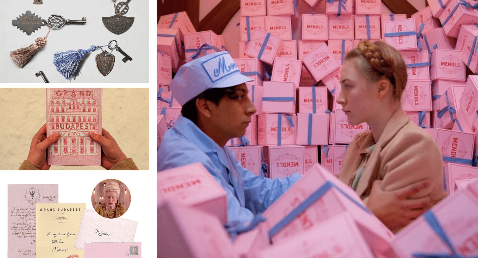
Examples of Poster Design and Illustrations
The final movie to look at, French Dispatch, is a tribute to his favourite magazine – New Yorker, where design plays a supporting role in journalism. Designers Erica Dorn and Javi Aznarez created a fictional magazine for the purpose of the movie that lies at the heart of Anderson’s love letter to print journalism.
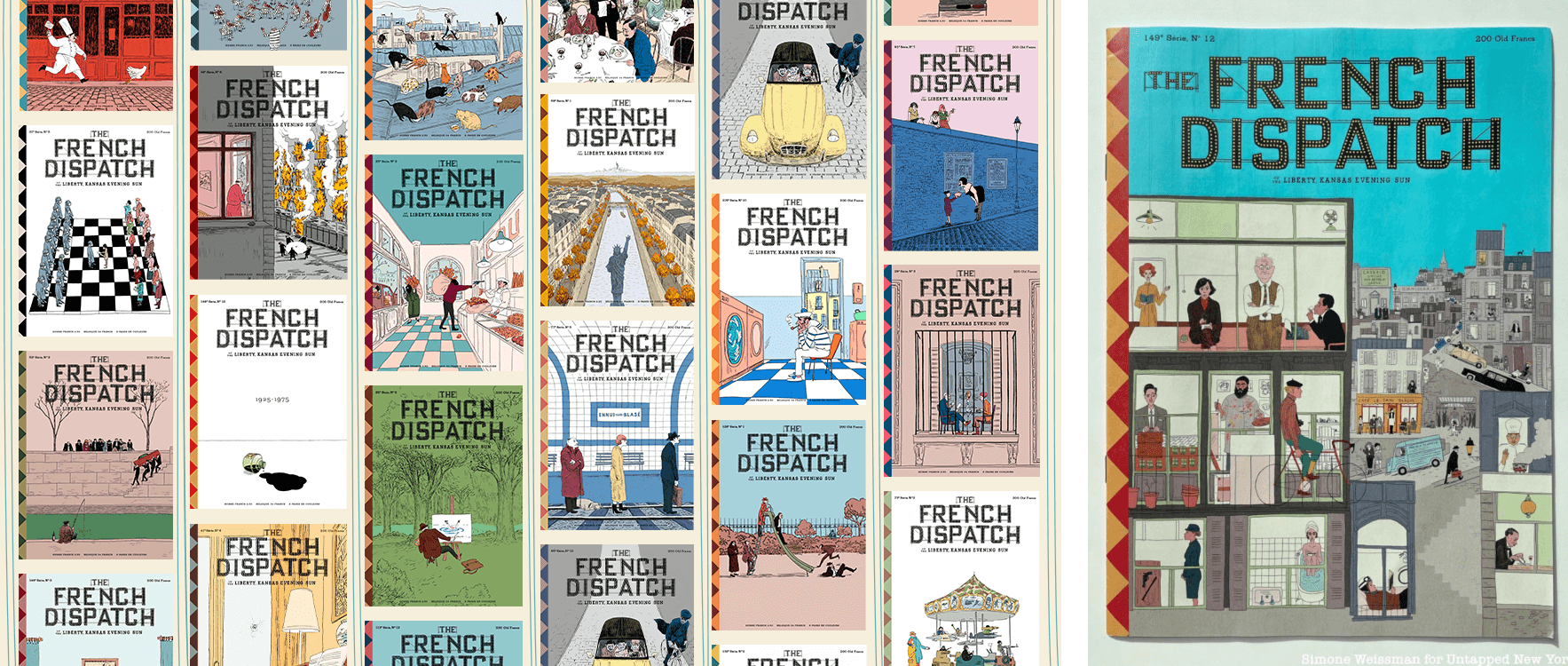
French Dispatch front cover examples
The love for nostalgia
Anderson’s films often draw inspiration from various artistic movements, design styles, and historical periods. He references mid-century design, vintage graphics, and retro aesthetics, creating a sense of nostalgia and timelessness.
Overall, graphic design in Wes Anderson’s movies is a fundamental element that contributes to the unique visual language and distinctive aesthetic of his films. Through careful attention to detail, symmetry, colour, typography, and handcrafted elements, Anderson creates visually stunning and immersive worlds that enhance the storytelling and captivate audiences.
And well, he makes my designer’s heart bit faster every time I see a new trailer 😉 Are you ready for Asteroid City?


