The Evolution of the Hamburger Menu Button: From Xerox to Mobile Apps
The hamburger menu button is a design element that has become ubiquitous across many websites and mobile apps. It consists of three horizontal lines stacked on top of each other, resembling a hamburger, hence the name — there are other versions with different names as displayed below. But where did this design element come from, and how did it become so widespread?

The Origins of the Hamburger Menu Button
The hamburger menu button was first introduced by the Xerox Star, a computer workstation released in 1981. The Xerox Star was one of the first graphical user interfaces (GUIs) to feature a menu bar at the top of the screen. The menu bar contained a list of options, but as the list grew longer, it became unwieldy and difficult to use. To solve this problem, the designers of the Xerox Star — namely Norm Cox — introduced the concept of a collapsible menu, which could be hidden or revealed with a single click.
After the Xerox Star, however, the hamburger menu icon disappeared for some time.
Its graphic design was meant to be very “road sign” simple, functionally memorable, and mimic the look of the resulting displayed menu list. With so few pixels to work with, it had to be very distinct, yet simple. I think we only had 16×16 pixels to render the image. (or possibly 13×13… can’t remember exactly)
Norm Cox
The Hamburger Menu Button Goes Mobile
Fast forward to 2009, and the hamburger menu button made its first appearance on a mobile device. With the new, much smaller, interface that smartphones had, designers had to look for a way to make everything fit onto a 4-inch screen. It isn’t entirely clear what app used it first but most sources credit Loren Brichter, the creator of the popular Twitter client Tweetie and then Apple designer.
Loren Brichter was looking for a way to make the app more user-friendly on the small screen of an iPhone. He came up with the idea of using the hamburger menu button to hide a list of options, making the app easier to navigate and freeing up valuable screen real estate.
Facebook also seems to have played a large part in spreading the use of the hamburger button for menus. In 2008, it started using a grid icon before later adding a row to the icon in 2009, then finally in 2010, the grid became bars.
Other apps of the same time period utilised a hamburger menu button including Voice Memos (iOS), Reader, Twitter Bootstrap, and Starbucks which is why it is difficult to say with certainty which one ultimately led the trend.
The Hamburger Menu Button Today
From those early apps and adopters, the hamburger menu button took off. It became a popular design element for mobile apps, and eventually made its way to desktop websites as well. Today, you can find the hamburger menu button on everything from social media apps to e-commerce sites.
Controversy
Despite its widespread use, the hamburger menu button has been the subject of some controversy. Critics argue that the icon is not intuitive and can lead to confusion for users who are not familiar with it.
Some designers pointed out that the hamburger menu also made for a more tortuous user experience. It increased the number of taps required to access these features, they argued, and added to the user’s cognitive load. As Luis Abreu described, “Even if people are aware [of] and value a feature [inside the hamburger menu], this pattern introduces navigation friction.”
Finally, other critics brought the claim that even the icon’s graphic design was flawed:
[It] doesn’t really look like a menu, unless you already know that is what it represents. The website designer knows it is a menu, so do the developers and wider stakeholders but many users do not.
Innovation Digital
Alternatives
Given the controversy covered above, it is no surprise that designers have tried to find alternatives to the hamburger menu button and associated menu.
Some of those alternatives are:
Simple Tab Bar
If your website or app has multiple sections or categories, tab bars can be an effective navigation option. They allow users to switch quickly and without having to search through a menu. The tab bar is considered one of the simplest navigation patterns, but there are several factors to consider when designing it for your product. The first is that you should have more than four content areas to make use of a tab bar. The second is that one category should always be highlighted with colour — or another visual identifier — and remain active. The third is that the most common positions for a tab bar are at the top or bottom of the screen, depending on the digital product.

Progressively Collapsing Menu
The progressively collapsing menu is a versatile navigation option that caters for a variety of devices. It includes multiple navigation items and a “More” option, similar in appearance to a standard tab bar with a “More” button. However, the difference is that the progressively collapsing menu adjusts the number of displayed categories based on the screen size, with all remaining categories in the “More” option. For instance, it can display three categories on a mobile device, five on a laptop, and ten on a widescreen PC monitor.

Scrollable Navigation
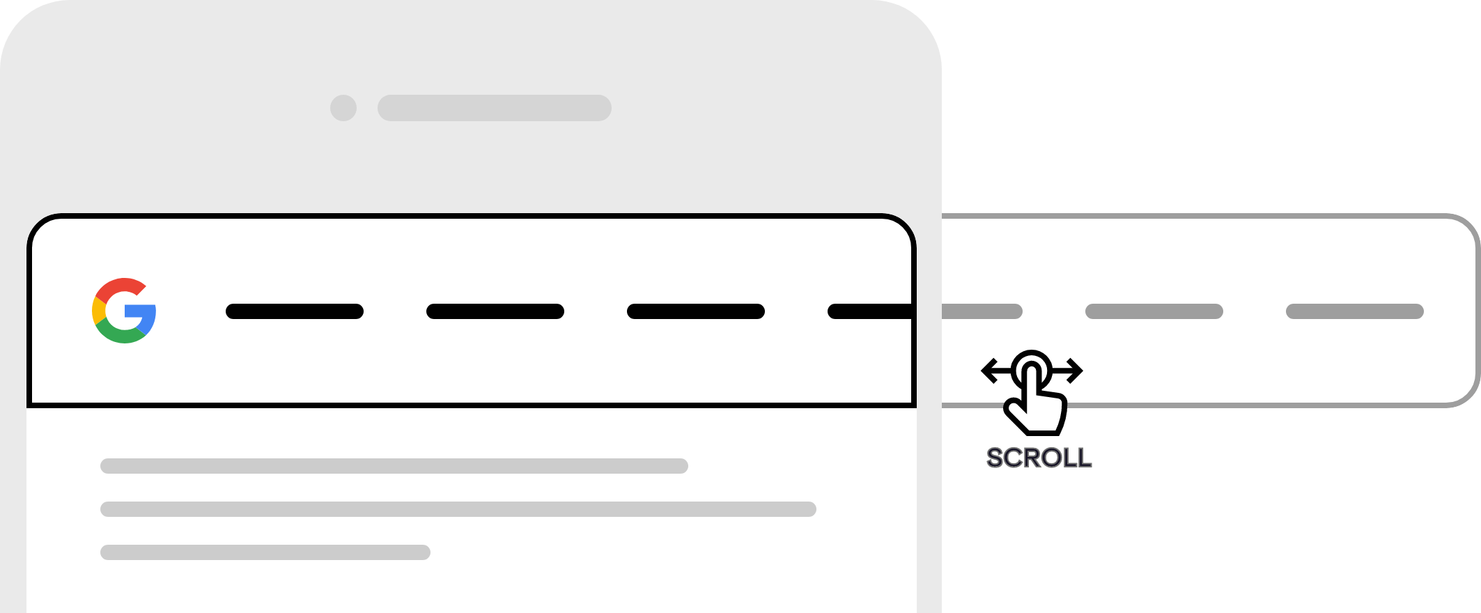
Scrollable navigation is a common choice for interfaces where it is difficult to decide on navigation priority as they are all of equal importance. For instance, it can be useful for a news website where the user is expected to browse content and there is no need to prioritise categories. Categories are displayed in a carousel and can be scrolled through by hovering or tapping a button. One downside of this navigation pattern is that only a limited number of categories can be displayed simultaneously, with access to others requiring scrolling.
Dropdown Navigation
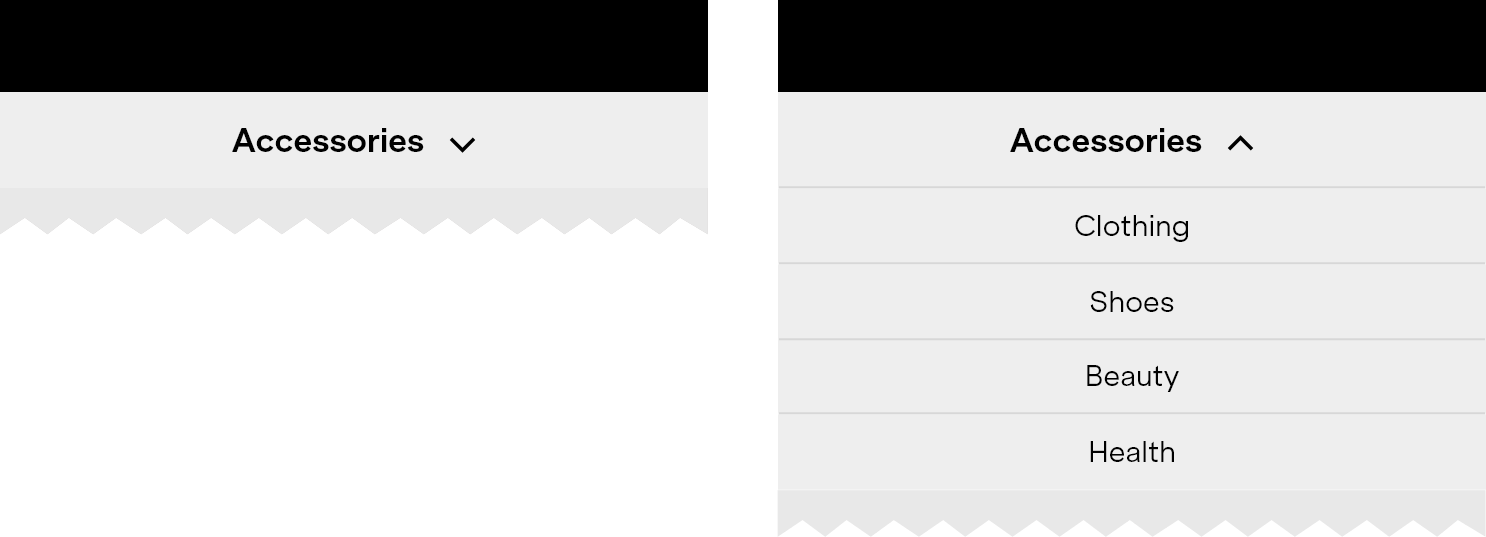
If you have a group of related categories that need to be prioritised in some manner, dropdown menus can serve as a viable alternative to the hamburger menu. This particular navigation pattern involves the use of the main label as both the page title and the title for the group of similar categories. For instance, upon entering a webpage, you might notice a main word at the top of the page with a downward arrow. This indicates that clicking on it will reveal other similar categories, which can be considered as children of the current page.
The Hamburger Menu Button in Numbers
Despite the controversy surrounding the hamburger menu button and the increase in viable alternatives, it remains one of the most widely used design elements on the web. Here are a few statistics that highlight its popularity:
- According to a survey by Statista, as of 2021, 71% of mobile apps use the hamburger menu button as their primary navigation option.
- Another survey by Nielsen Norman Group found that 84% of e-commerce sites use the hamburger menu button.
- In an analysis of 50 popular websites, the research firm Baymard Institute found that 96% of sites used some form of hidden or collapsible navigation, with the hamburger menu button being the most common choice.
- In a study of more than 4 million mobile website pages, Google found that the hamburger menu button was the second most common type of menu icon, behind only the home icon.
These statistics demonstrate the widespread adoption of the hamburger menu button across a variety of industries and use cases. While it may not be perfect, it remains a popular choice for designers looking to create a clean and streamlined user experience.
Conclusion
The history of the hamburger menu button is a fascinating story of innovation and evolution in design. As we continue to push the boundaries of what’s possible with technology, it’s exciting to think about what new design elements will emerge in the years to come.

