The redesigned website incorporates several marketing strategies to boost growth and engagement:
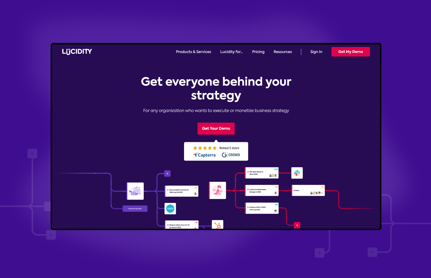
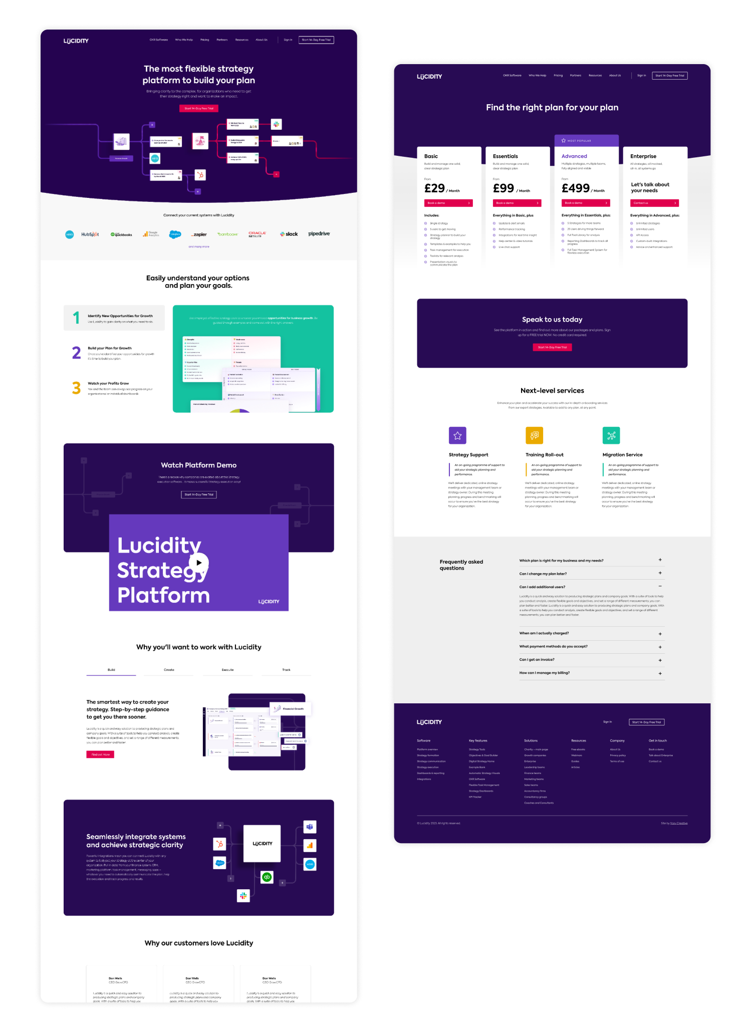
Clear CTAs: Strategically placed and visually appealing calls-to-action to guide users toward key actions, such as signing up for newsletters or trying out services.
Content Strategy: An updated blog and resources section providing valuable content that positions Lucidity as a thought leader in productivity tools.
SEO Optimisation: Improved on-page SEO elements, including meta tags, keyword-rich content, and optimised images to enhance search visibility.
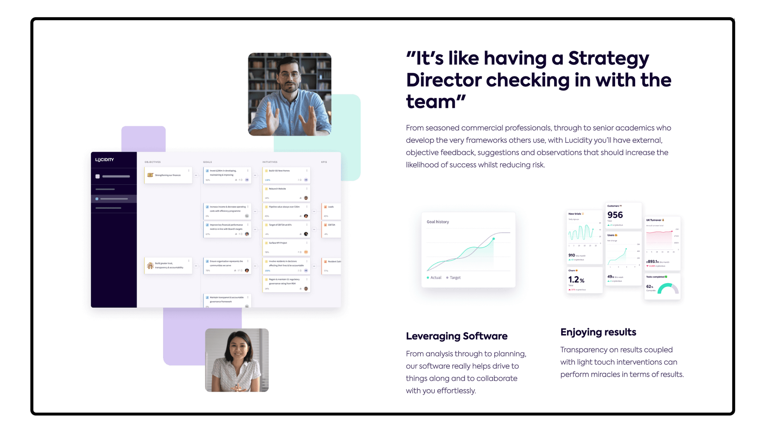
Social Proof: Testimonials and case studies prominently displayed to build trust and credibility with potential users.
Mobile Optimisation: A responsive design ensuring a seamless experience across all devices, catering to the increasing number of mobile users.
Analytics Integration: Enhanced tracking capabilities to monitor user behaviour, enabling ongoing optimisation based on data-driven insights.
The redesign of Lucidity’s website transformed it into a user-friendly platform that aligns with the needs of its audience while effectively conveying the brand’s mission. The integration of key marketing components further enhances its effectiveness, making Lucidity a leading contender in the productivity tools market.
