The reality behind design trends (you won’t find here 10 design trends for 2024)
Nowadays, designers are increasingly experimenting with typography, colours, and imagery. It’s exciting to see that we live in a time where creativity and playfulness are valued. However, yearly trends resemble fast fashion, and I’m uncertain if we should adhere to this trajectory.
In the realm of branding and digital space, can we effectively balance form and function? Is “good design” solely about aesthetics?
What is design as a speciality?
It is a way to communicate ideas, concepts or plans and communication starts with graphical not written representation.
The history dates back to the earliest days of human civilisation – ancient cave paintings, Egyptian hieroglyphs or Greek vase paintings are some of the earliest examples of language and symbolism. During the Middle Ages, illustrations and books illuminated the few who were able to read. In the Renaissance artists such as Albrecht Dürer and Leonardo da Vinci used the craft of drawing to explain their concepts in detail – nowadays, technical drawings are a standard way to plan work in engineering and technology. The Industrial Revolution improved printing technology, so commercial materials, illustrations for children and newspapers were available to a wider audience. Books and magazines are still (thankfully!) enjoyed by millions of people as affordable entertainment. Whether you think about products, fashion, interior design, digital space, books or prints, design has always been and still is a crucial element of our lives.
This discipline focuses on the interaction between a person — and the environment, with an emphasis on function, context, culture, aesthetic, and societal considerations. We work on business strategy, virtual environments, digital interfaces or design services. But what makes a good design?
Aesthetic at your service
Maybe you’ve heard about one of my favourite art movements – fauvism. I always had a soft spot for wild brushwork and strident colours in simplified form. In 2023 strong colours and bold shapes took over fashion and interior design, but not many of us realise it’s inspired by fauvists.
Fauvism’s goal was to separate colour from its representational purpose and allow it to exist as an independent element. Colour represented mood and created a structure without having to be true to the reality. The focus was on the balance of the composition. Above all, Fauvism valued individual expression. The artist’s experience, his emotional response to nature and intuition were more significant than academic theory.
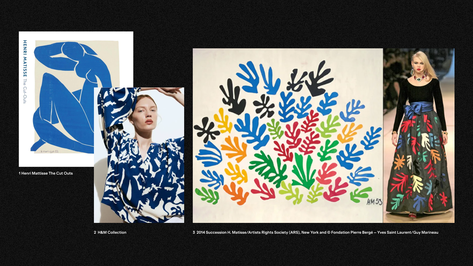
It makes sense why there is a renaissance of fauvism in fashion and interior design – after all, it’s all about self-expression. Aesthetics is one of the core design principles, defined as pleasing qualities. It includes factors such as balance, colour, movement, pattern, scale, shape and visual weight. On the other hand, UX is like a digital Bauhaus – focused purely on functionality, research and testing. Functionality is and should be a first step, but I believe we need a mix of Bauhaus and Fauvism 😉 Attractive layouts that complement usability. After all, beauty is one of the main human needs.
Used by itself, aesthetics is a purely decorative exercise. So, what to do to ensure that the design we create is not only beautiful but also meaningful and usable?
Design backbone? Brand Research and Values!
Colourful, psychedelic shapes, bubblegum pinks, holographs and glowing metallic textures are another fashionable choice for designers in 2023. While I love colours and bold choices, I keep asking myself – what’s the reason to base company’s brand identity on 70′? Is there a story behind it? The Flower Power movement was focused on respecting for the planet over violence. The slogan was also the symbol of passive resistance and non-violence ideology created as opposition to the Vietnam War, so I’d be careful with using it in the wrong context.
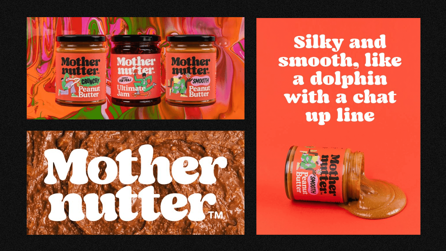
However, a brand design studio Analogue created a brilliant identity for Mothernutter (peanut butter!) inspired by 70′. When it comes to protecting Mother Earth, the company gives 10% of their profits to charity. Their peanut butter is palm oil free, with sustainably sourced high oleic peanuts, roasted and blended here in Cumbria. A colourful, vibrant identity represents the brand culture and vision hence why it simply… feels right.
It’s a great example of finding a perfect balance between style (form) and function. Through Discovery and in-depth research we can ensure that brand character and visuals fit perfectly to the message we want to send to the world.
The healthy middle ground
So how can you, as a client (or a designer) ensure your projects are meaningful, beautiful and accurate without blindly following trends?
I truly believe that research is critical in any area of design, be it brand, poster, web design or animation. Collecting data through brand workshops with clients, user data or domain research should make it clear what direction your design should follow. Then we can gather inspiration from art, history, science or nature. Honesty in your company’s story is a key to create branding, which is true to your values and brand character rather than to current design trends. It’s worth focusing on “why” to ensure that happens:
- Why do we exist? What are our brand values, mission and vision? What do we want to represent?
- What is the brand character?
- Why does this style or aesthetic fit the brand?
- Why are we choosing a specific font? Does it fit the brand mission?
- Why should we use those specific colours?
- What feeling am I trying to create for my audience?
- Why do we use specific photography or illustration styles?
- Is it aligned to the overall look and feel?
It’s easy to follow a trap of functionality. Equally, with the popularity of social media and great visuals on every corner, it may be tempting to focus on pure aesthetics. As always, the truth lies somewhere in the middle.
Design’s dead, long live design!
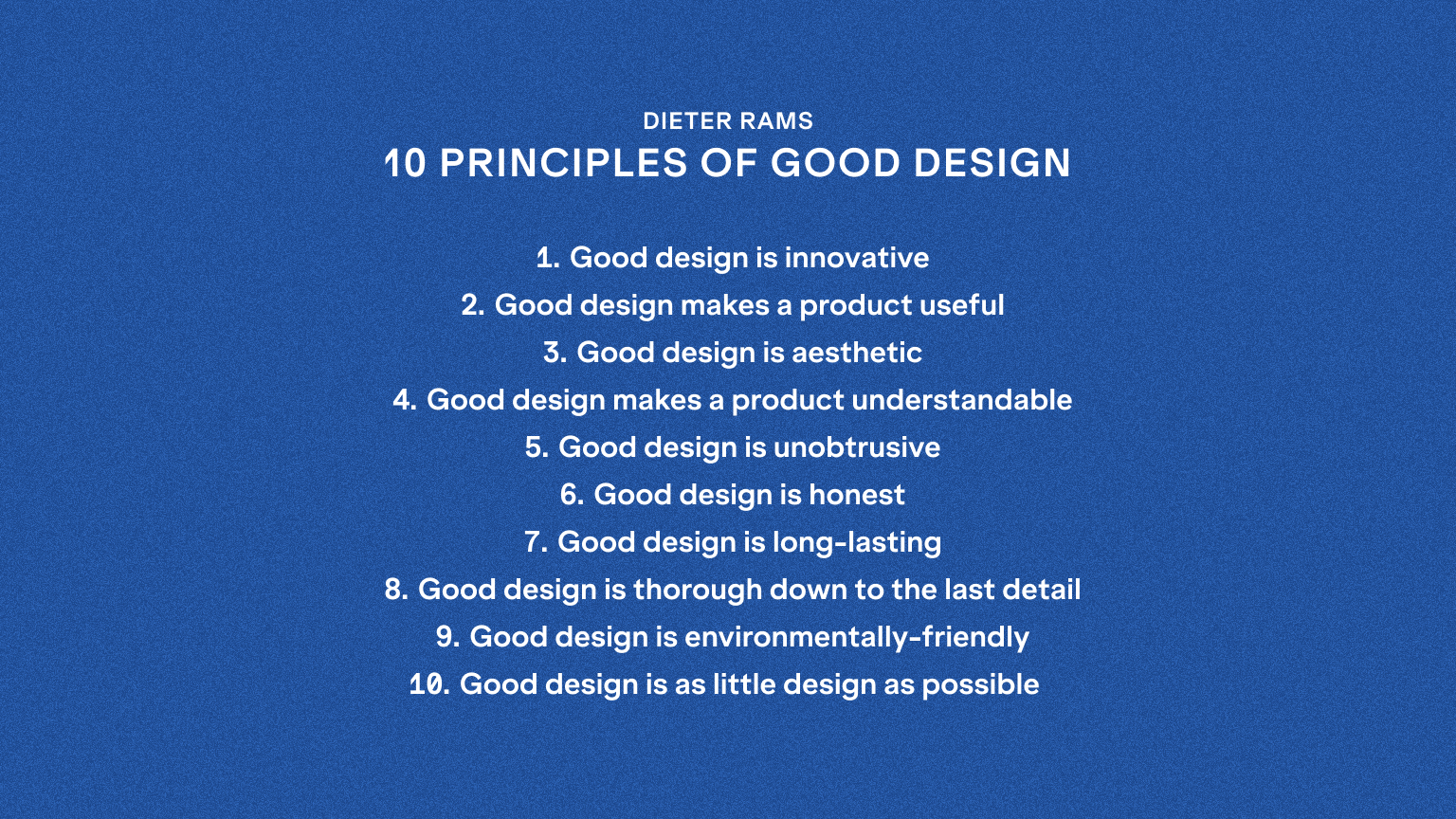
I often come back to Dieter Rams Ten Principles for Good Design. They remind me why I became a designer in the first place and what I want to leave behind.
I’m a big fan of experimenting with fonts, colours or shapes when designing brands or digital experiences. After all, one of the ways in marketing and crowded digital space is easily answered – to grasp attention. However, when the overall design choices are based on research, usability, honesty and history, the brand becomes strong and the graphics long-lasting and relatable.


